Portfolio Page
Click on any of the squares to get a better look!
Click on any of the squares to get a better look!

I was given the opportunity to design a tee shirt for Cheapo Records in Cambridge, and decided to capture one of the shop's most iconic features, its neon sign(s).
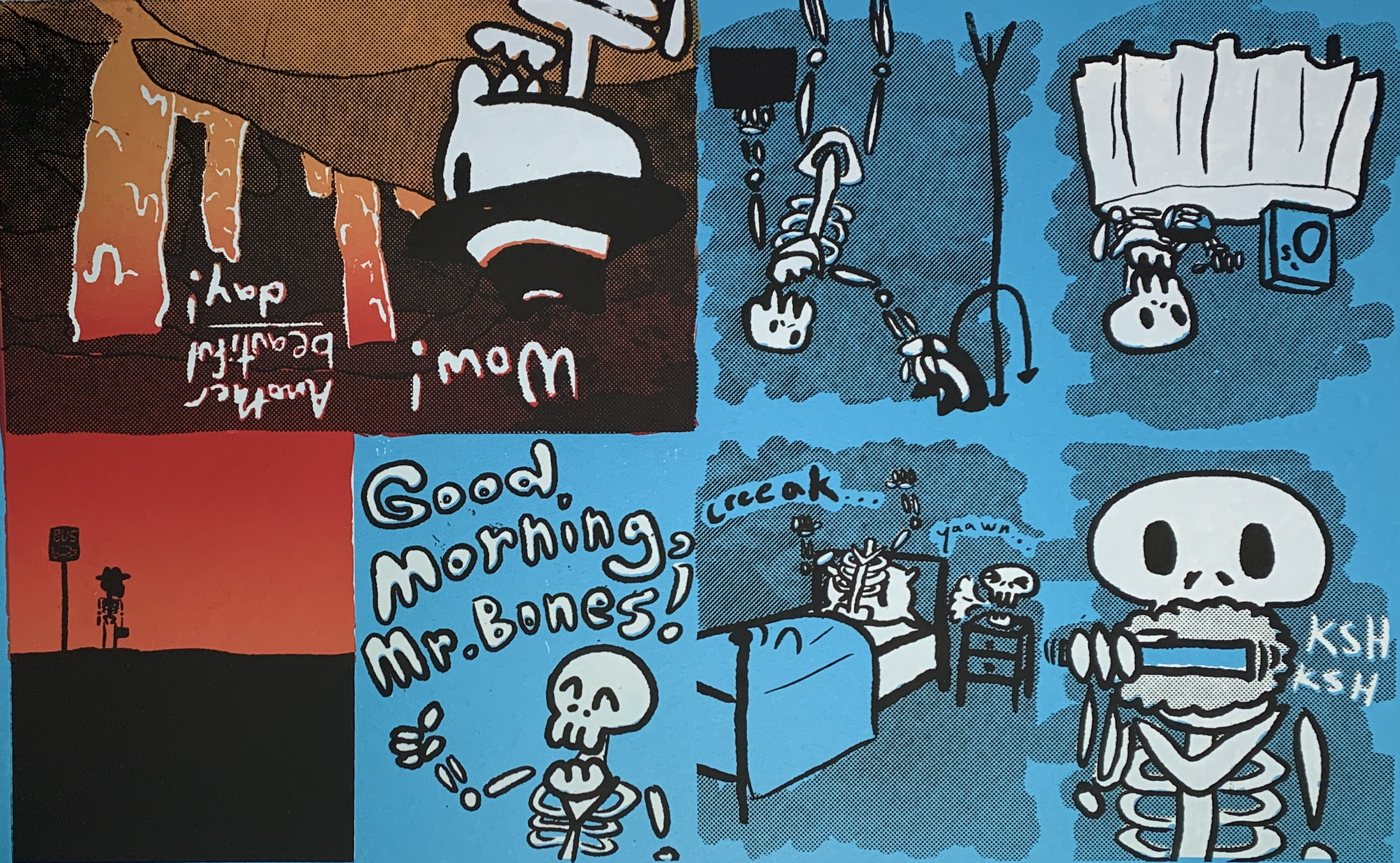
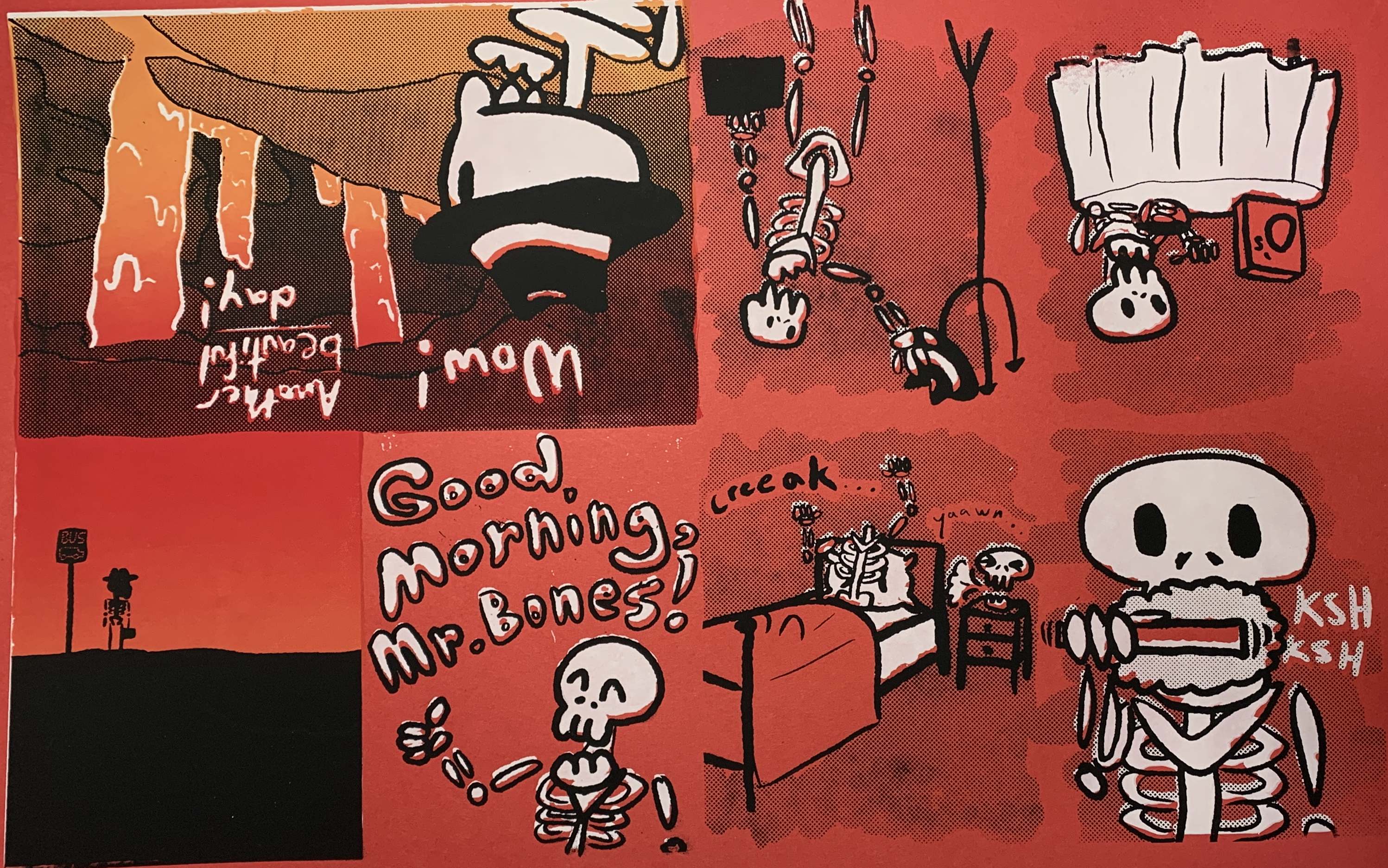
A three layer print on blue paper, with a split fountain on layer 2. Some variants are on red paper.
Original Sketch:
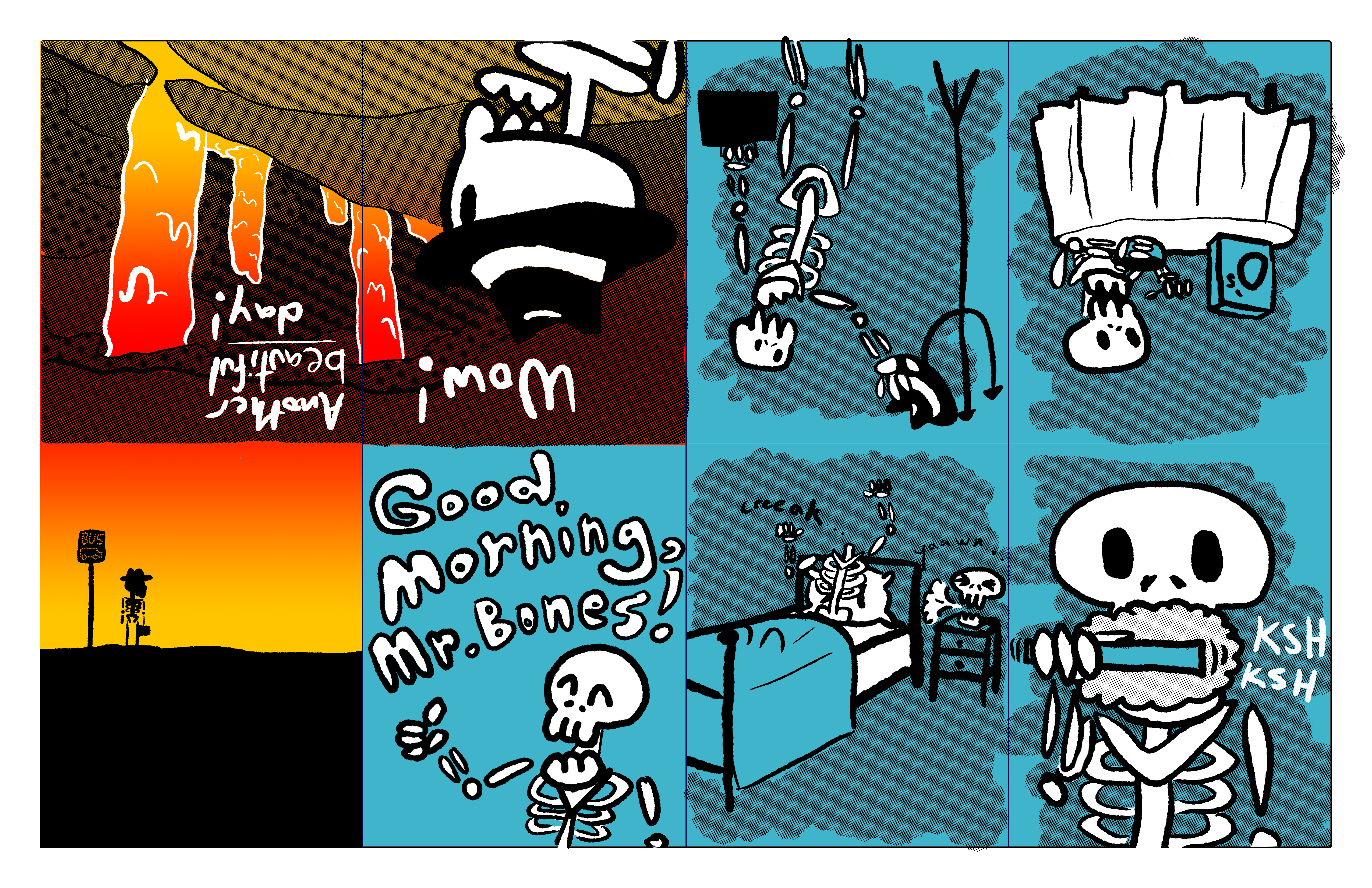
Red variant:
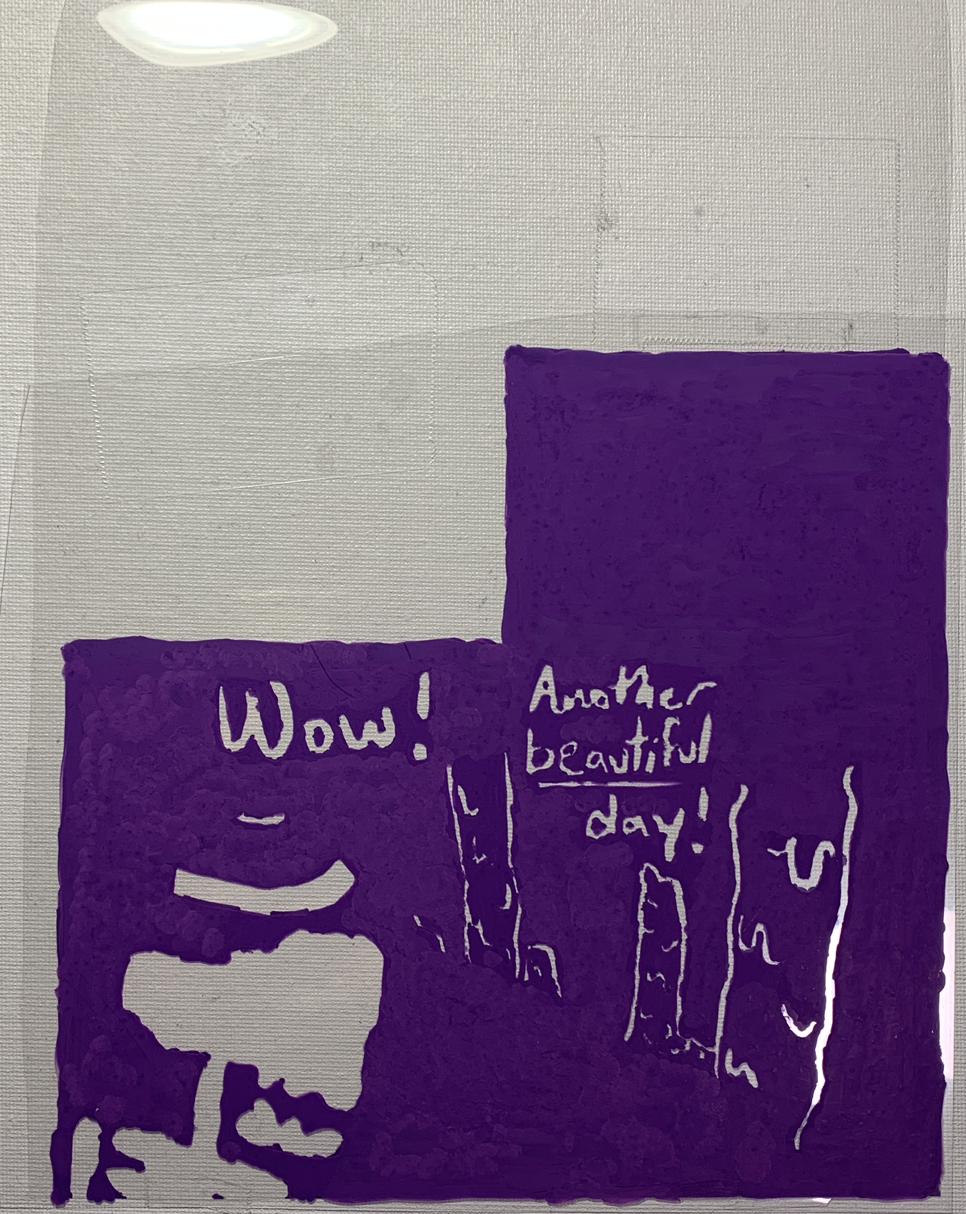
Acrylic layer:
Blunder in the process:


A two layer print on black paper. Idea from a reoccurring nightmare that I'm sure many other designers share.
Original Sketch:
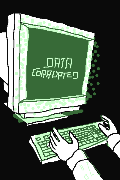
Rubylith layer:
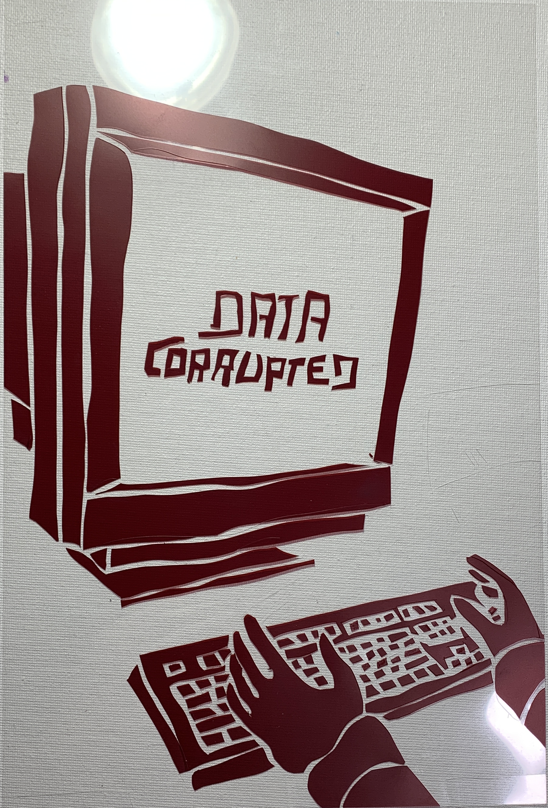
Acrylic layer:

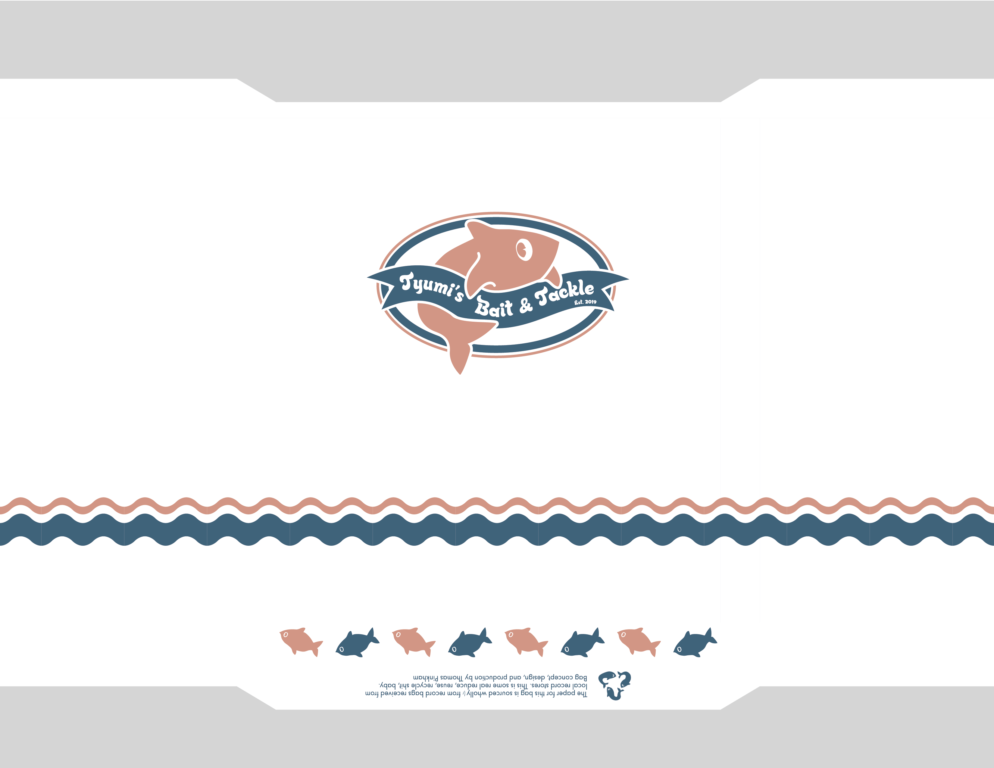
A collaborative effort between Ezra Gray and I, this was designed to serve as a CD version of King Gizzard's recyclable "eco" LP sleeve. The paper for it was sourced from bags received at local record stores, cut to 8.5 x 11 so it can fit into a printer.
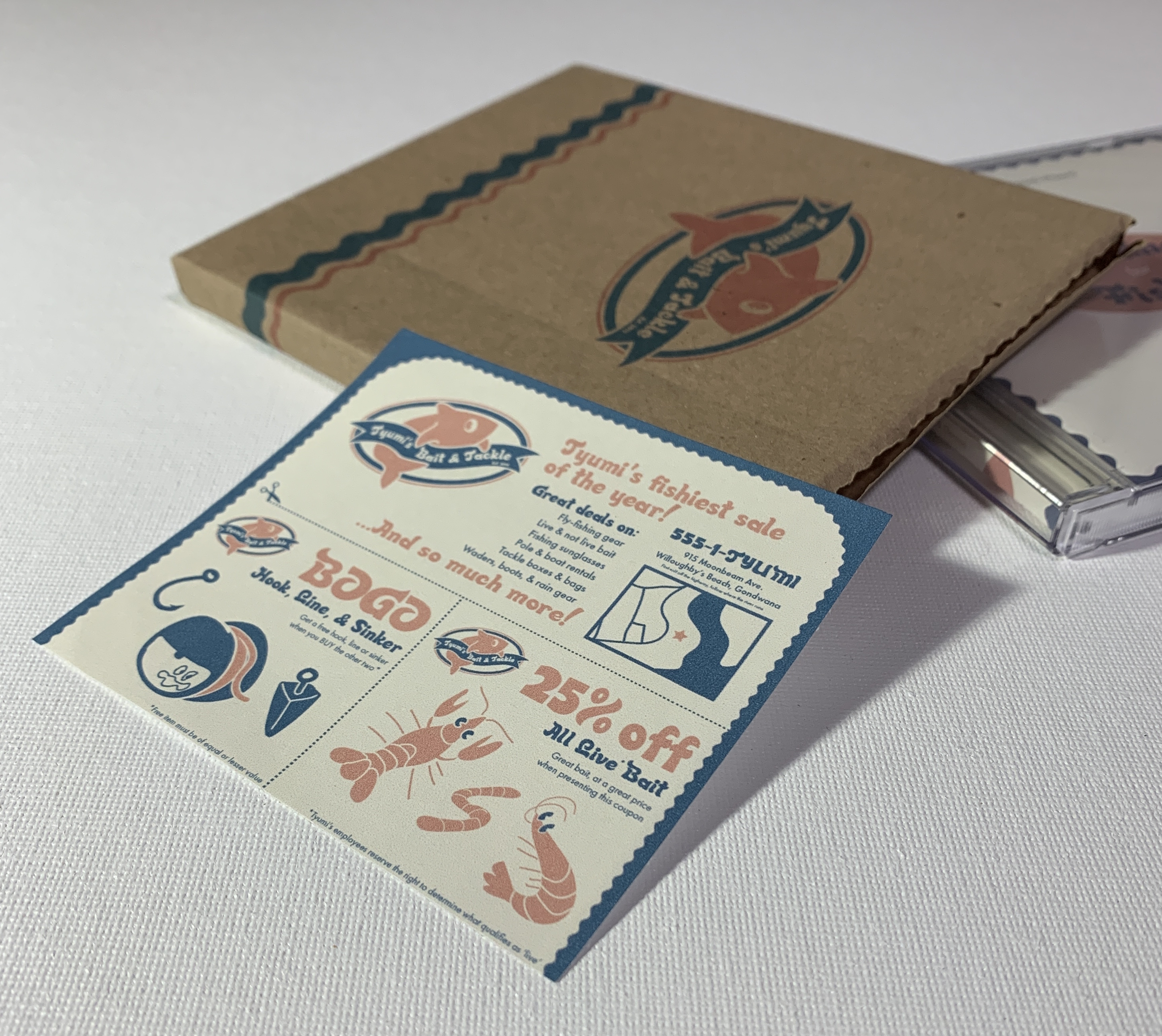
I tried to capture the feel of a fast food bag one would receive at a seafood place, while staying within the creative confines of Gray's design. Since I couldn't move on after finishing the bag, I also designed an insert in the style of junk mail coupon sheets.
Bag layout:
Coupon:
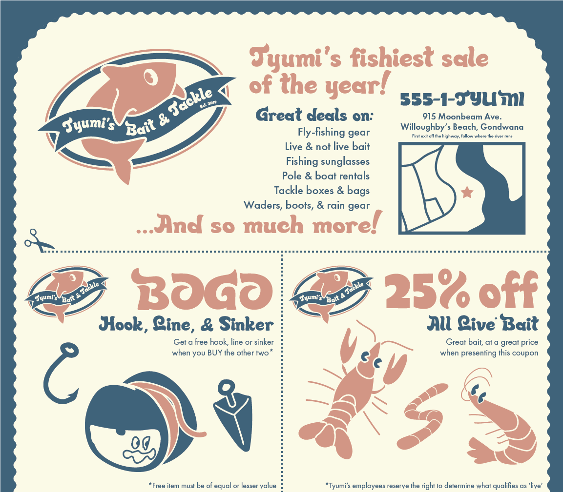
Tyumi's logo:

Bonus shrimp:

Bonus worm:

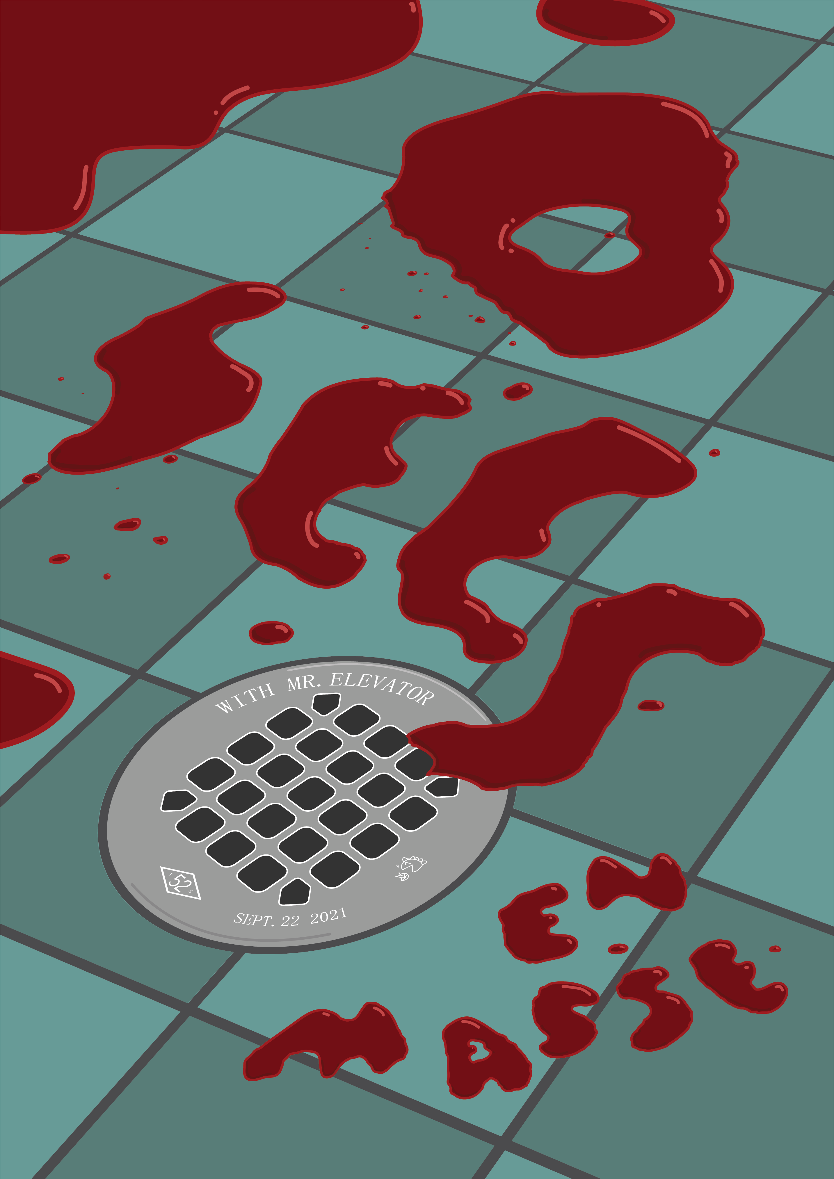
I created the large type practically by dropping food coloring onto a ziploc bag and going over a picture of it in Illustrator. I was also able to include the opener and venue in the details of the shower drain.

My most earnest attempt at juice-based product design.
I had originally made this as a gift in May of 2021, and it's spiraled from there.
Front:
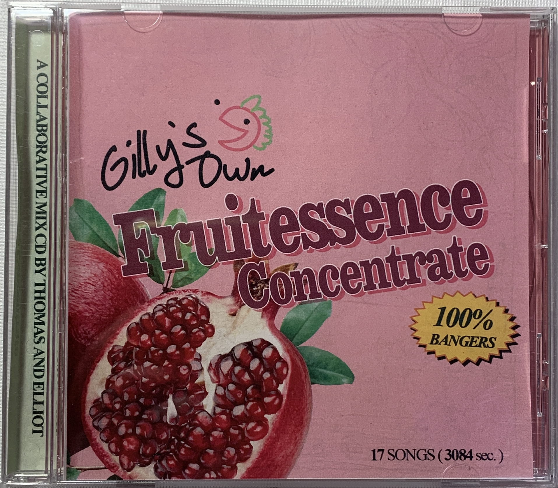
Back:
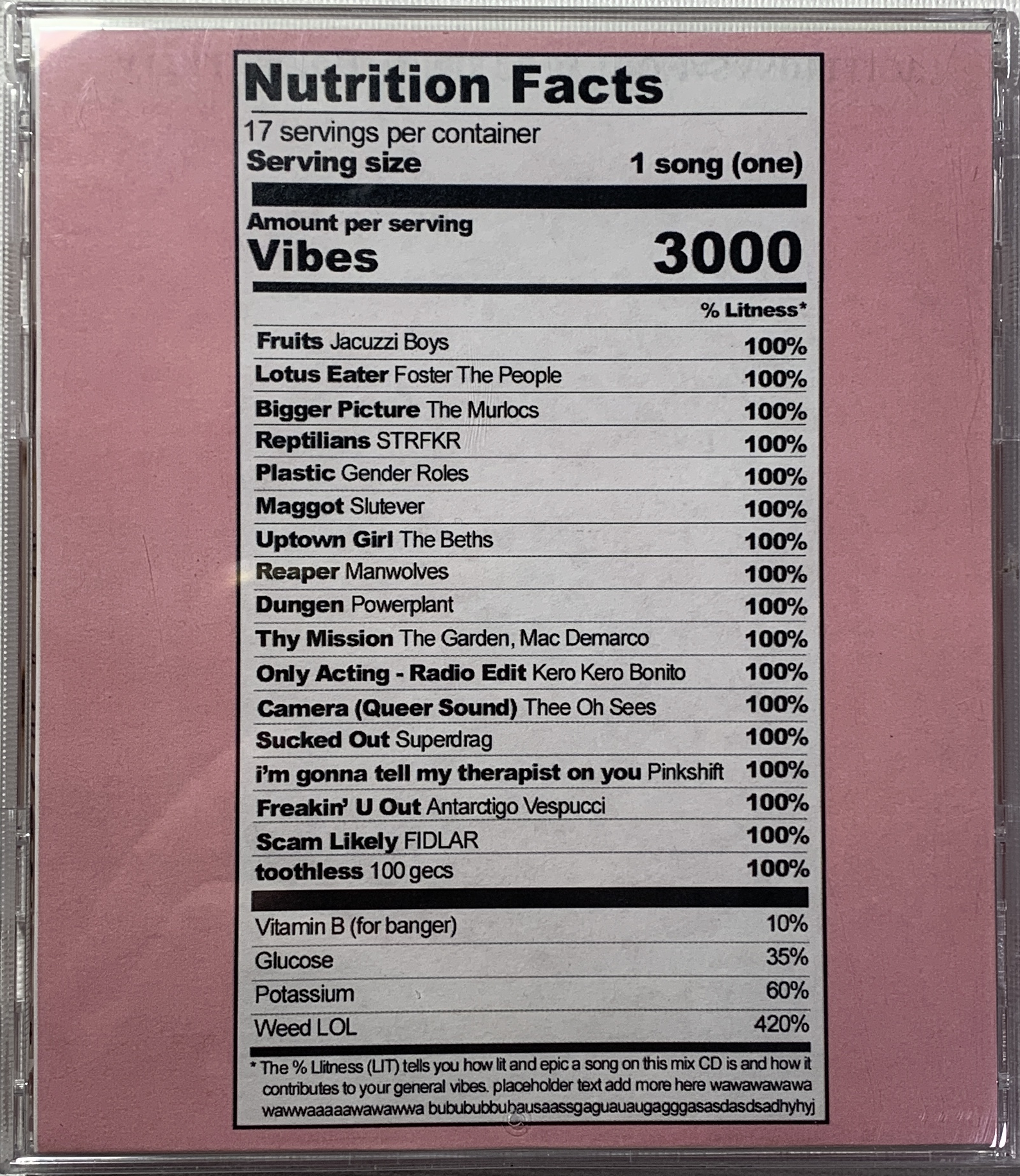
Inside:
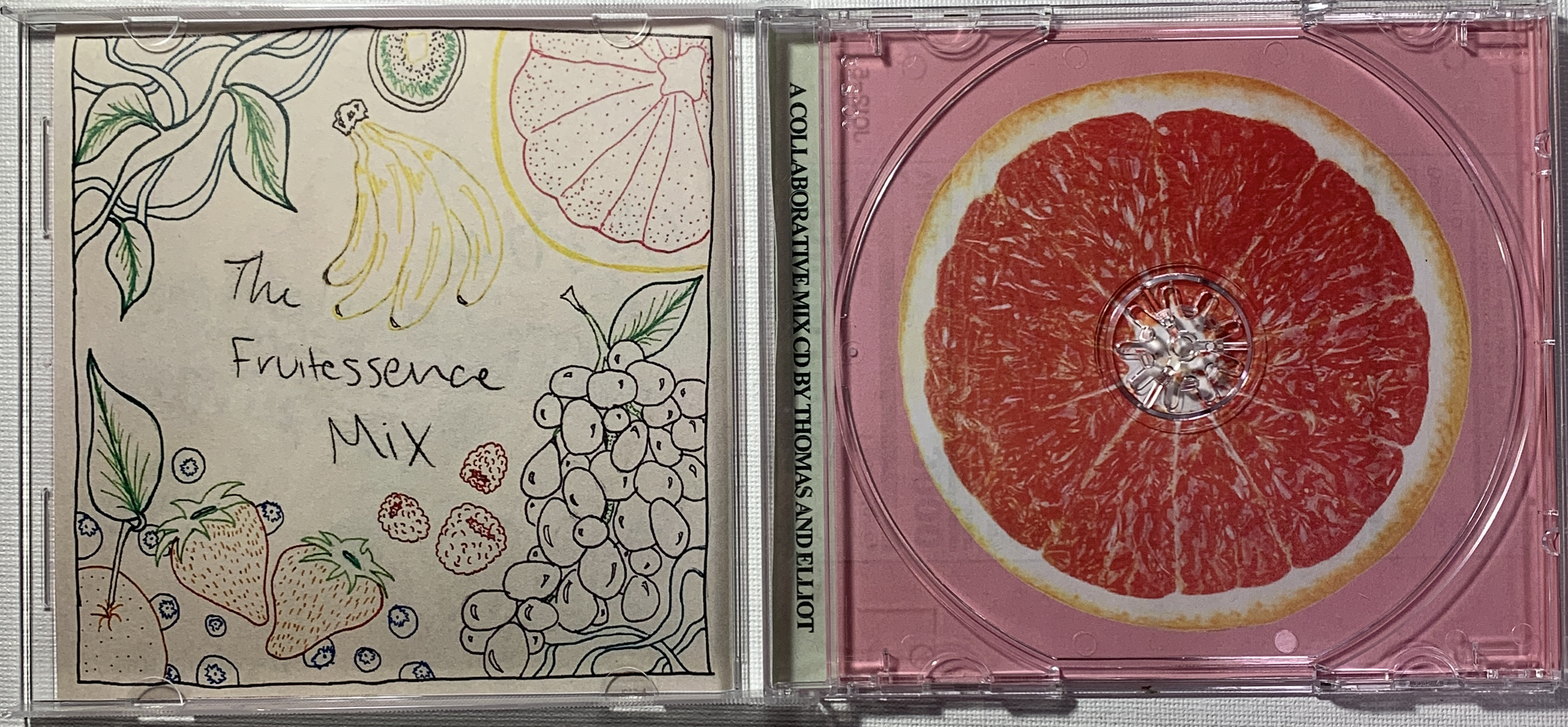
May of 2022 I was shipping something to a friend and wanted to add a fun bonus gift so I carved a lino block and stamped the back of a CD envelope to act as a new package.
Front:
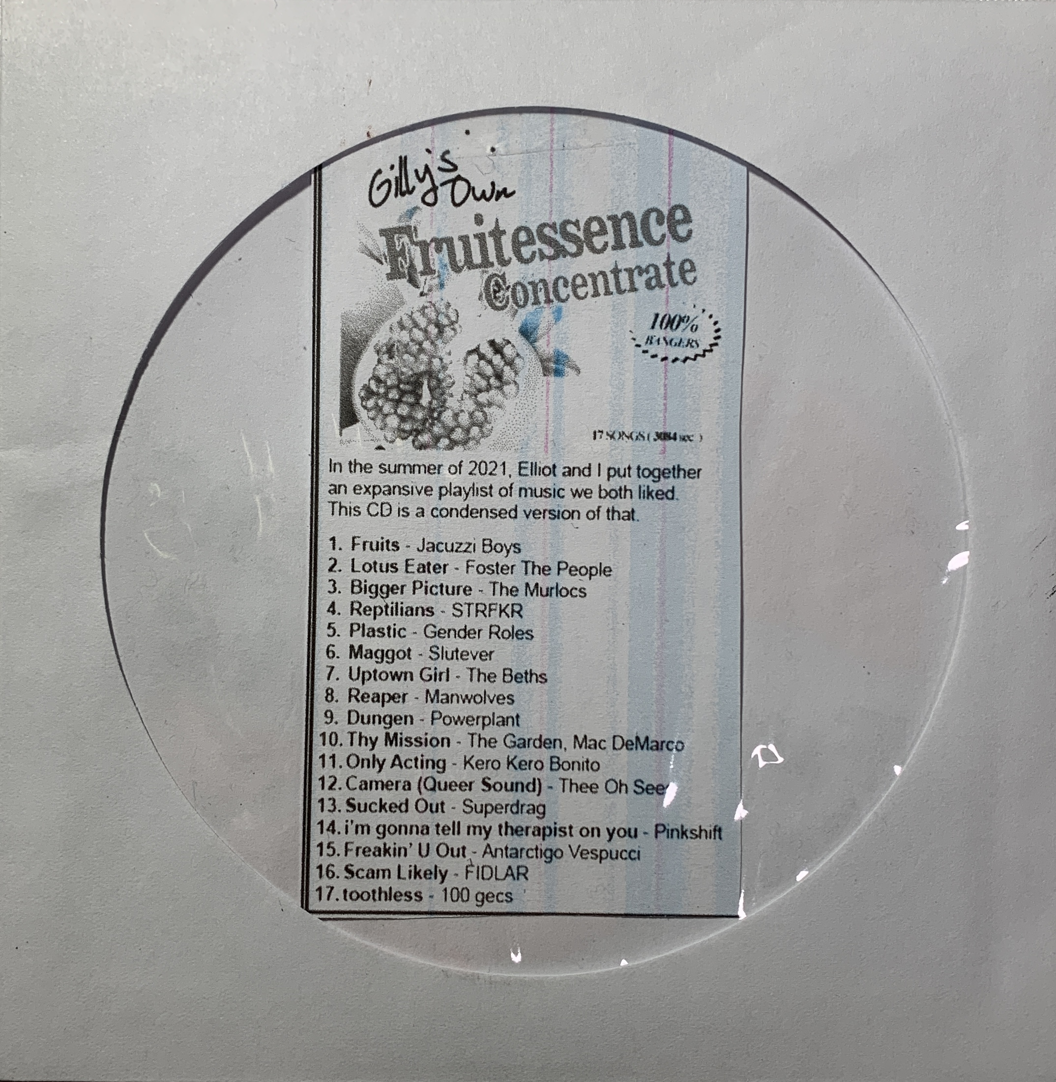
Back:
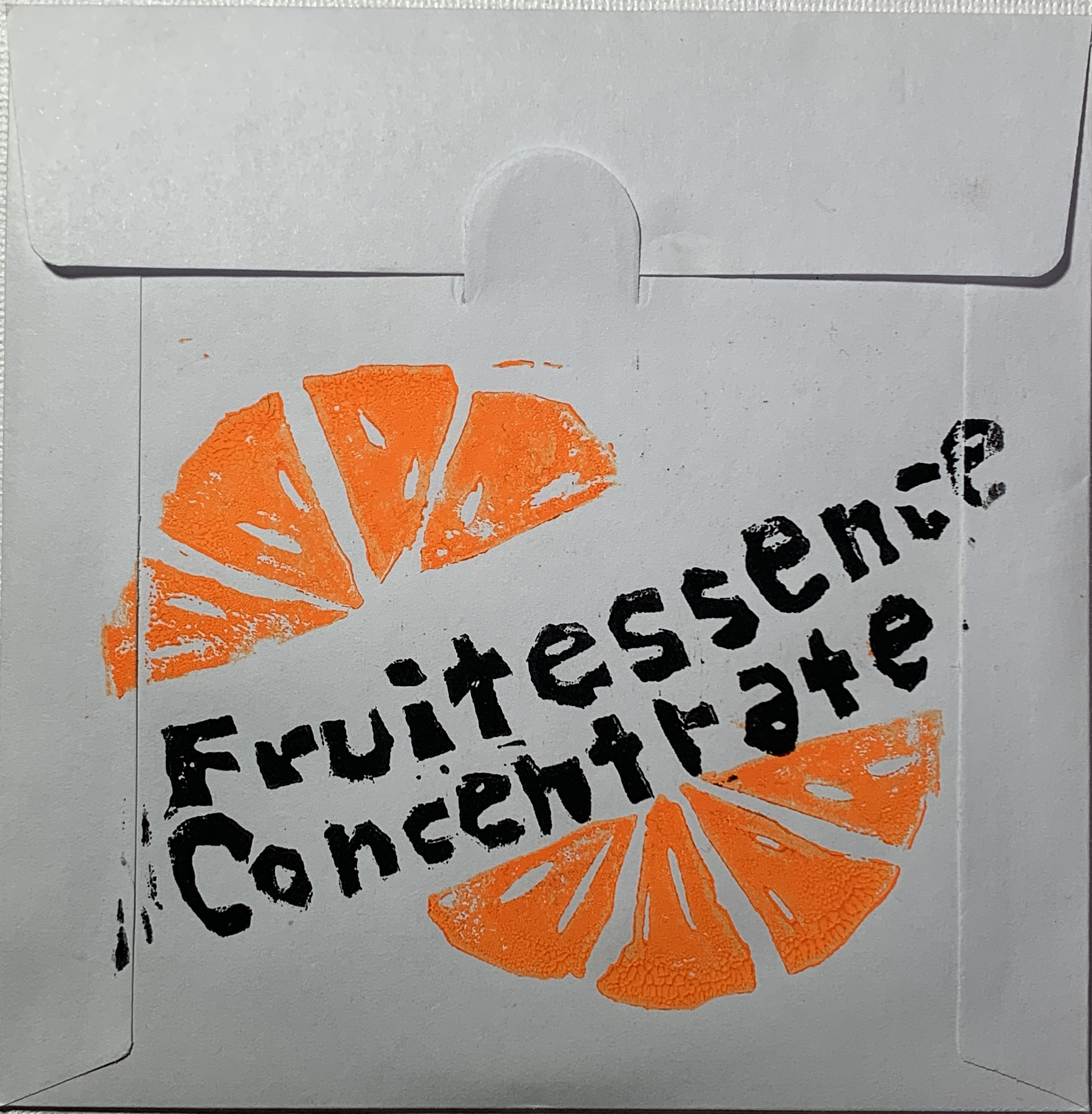
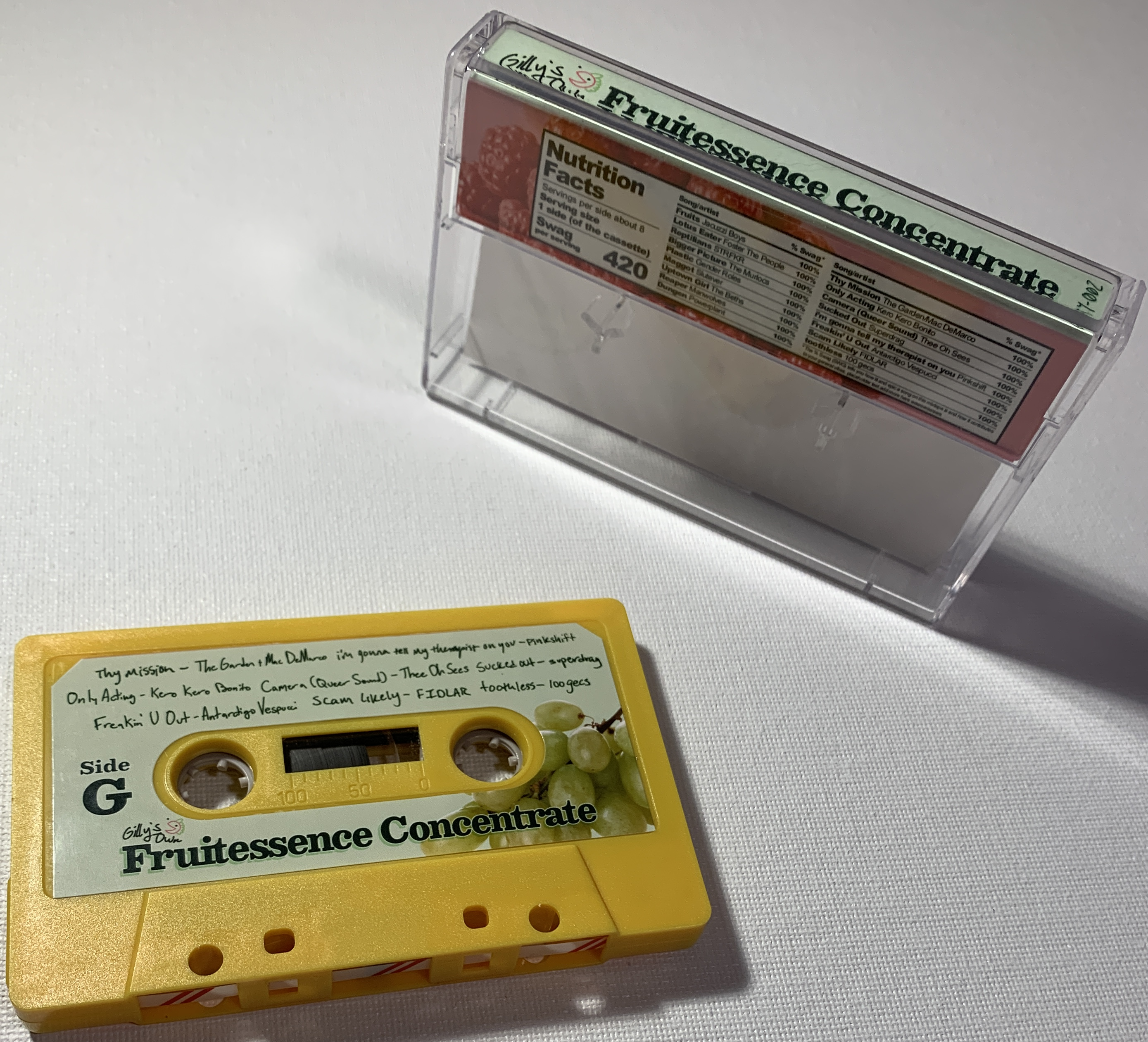
I also made a cassette version.
Front:
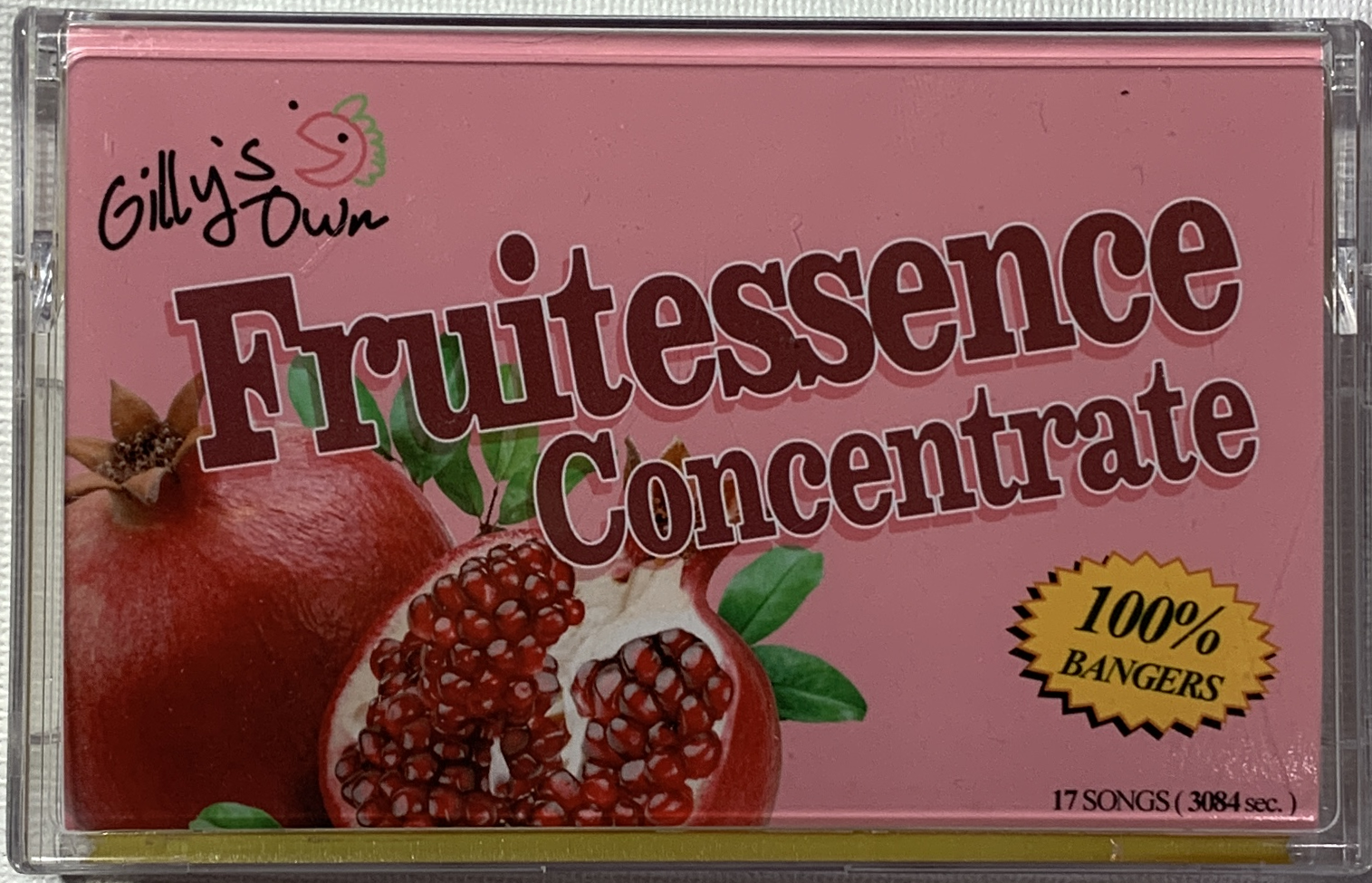
Inside:
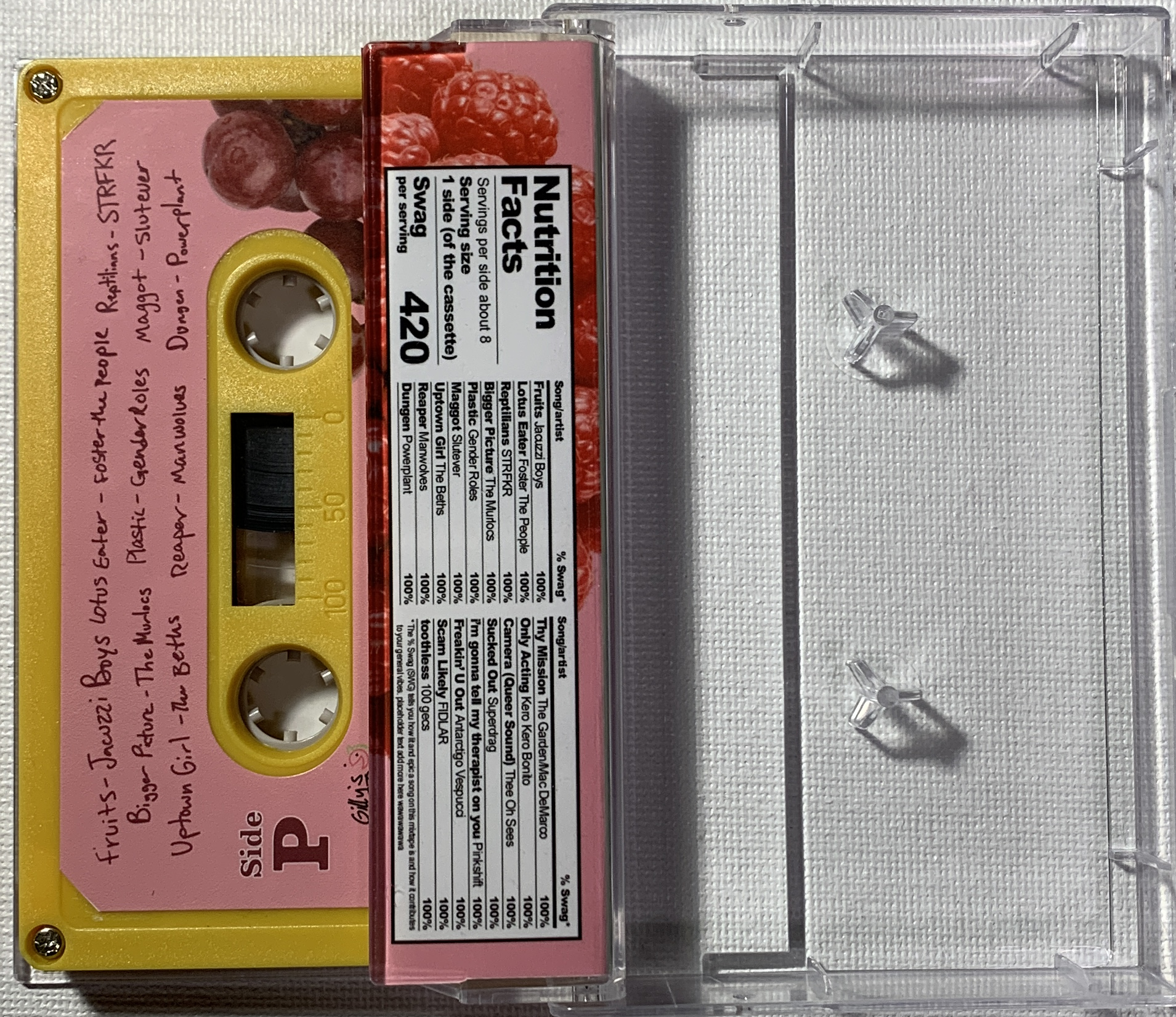
Extra image:
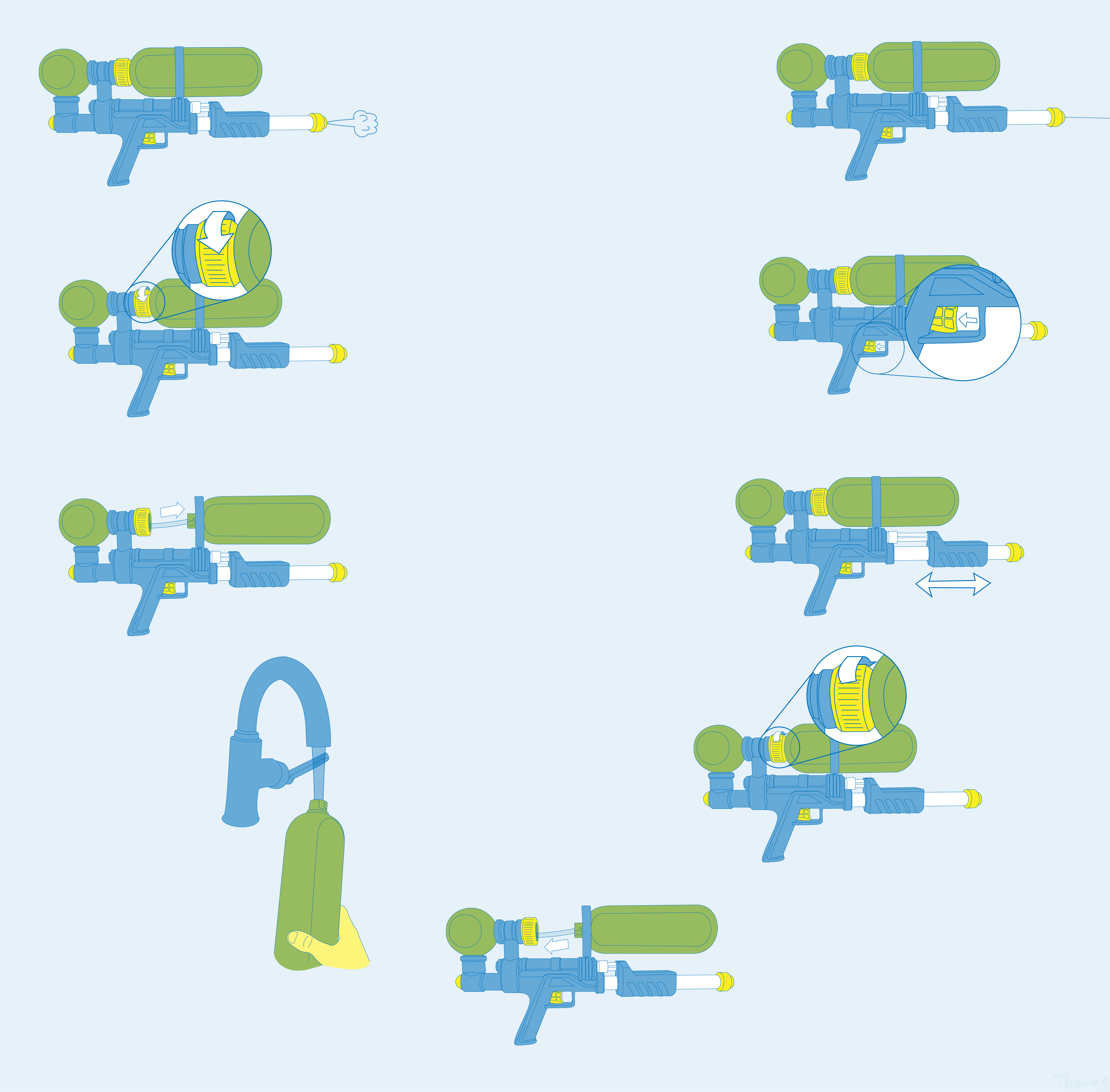
Tasked to create an instruction manual without words using a limited palette of two individual colors.

A project asking to create a poster for a movie using only 6 colors, I tried to incorporate the film's odd aspect ratio of 1.19:1 by making it the size of the beacon of the lighthouse.
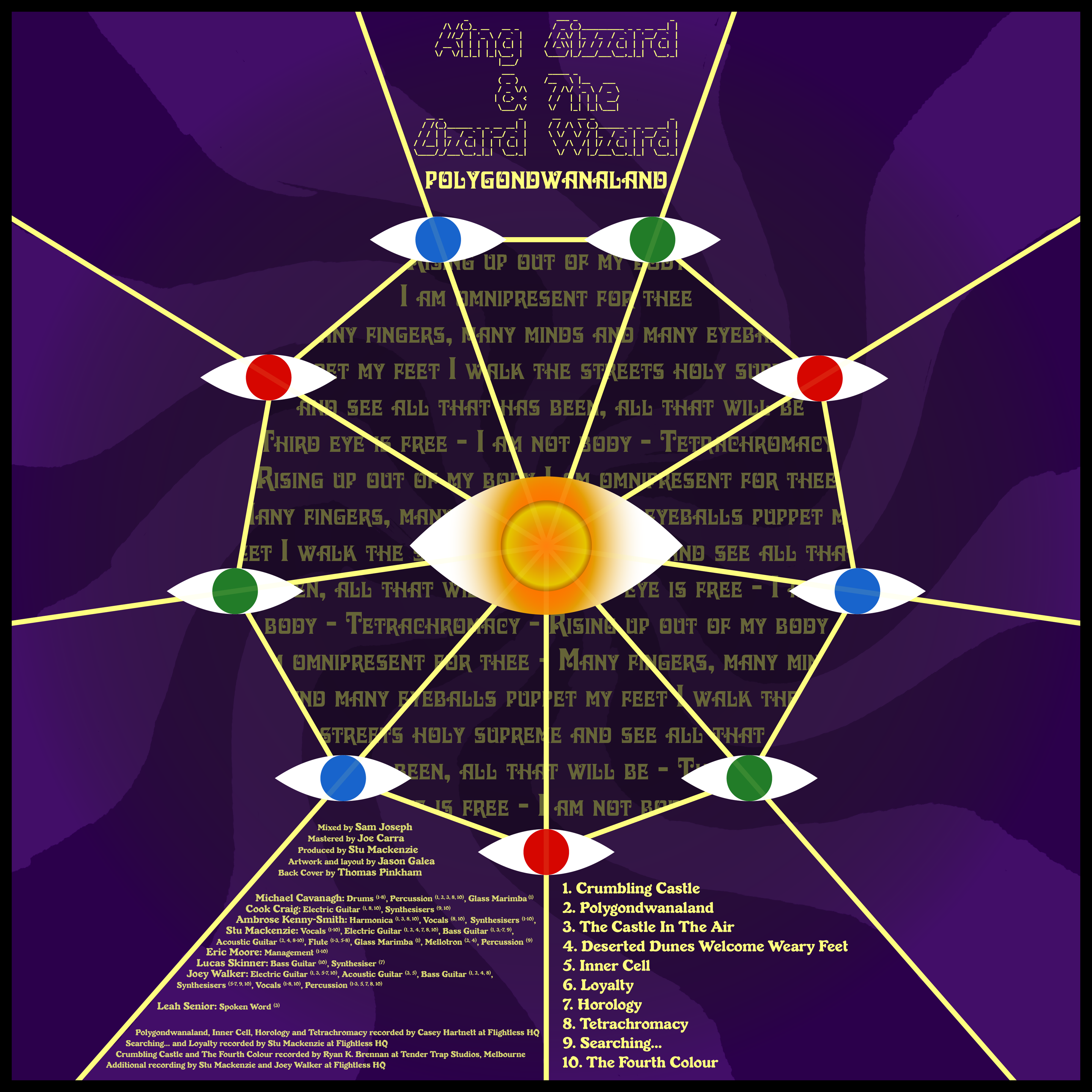
King Gizzard and the Lizard Wizard released their fourth 2017 album Polygondwanaland 100% for free, asking fans to create their own releases for the album. They provided a front cover and a small pool of images to take inspiration from, but no true back cover.

Originally intended to be realized as a patch, I designed this based off a lyric from King Gizzard's Murder of the Universe. I created two different palettes for this to capture both the front and the back of the album cover.

I emulated many of the features present in the design of the wonderfully chunky laptops provided by my school, deviating in places to make it more Baxter.
Unfortunately, a lot of the detail was lost in the final print since it was given a glossy finish.

Project from a digital art class I took in high school, we were assigned to create a travel poster for a fictional place.